A couple of days ago, we rolled out a refreshed warhol.org. This is the first refresh of the site since 2010! I’m excited to share some of the features in the new design as well as talk about why we made these various decisions.
Responsive Design
The first thing you may notice is that warhol.org now looks great on mobile devices like tablets, phones, and everything in-between. A responsive design was key to servicing what is now a very large audience segment for warhol.org; nearly 30% of our visitors are mobile. Of those 30%, a whopping 70% are on some sort of iDevice – like iPhones and iPads. Therefore, we’ve made sure that this new design looks just as good on a handheld device as on a desktop.
Responsive design is a rather new approach to a growing challenge amongst web designers and developers: 2012 was the first year where sales of tablets and smart phones outpaced desktop computers. Designing pages that ‘adapt’ to various screen sizes not only leads to a greater user experience, it also makes updating and maintaining pages much simpler. Instead of updating multiple versions of content, we only need to update one!

A Design With Room to Breathe
The new site obviously looks a bit different than the old warhol.org. The orange header has given way to a darker, colder grey, with the intent of allowing images to take center stage. The Warhol logo is now chameleon-like, morphing colors to respond to image content on each page – a function of the logo design which was intended when it was designed in the late 1990s. We use white and black very sparingly across the site in order to further emphasize images and graphics and instead rely on subtle grays for variation and emphasis.
There’s a plethora of white space as well, which allows the design a bit more breathing room. This, in addition to the use of a new CSS-imported typeface (our brand’s typeface Akzidenz Grotesque) and CSS-driven text optimization rules, leads to better legibility of text on the website, especially on mobile devices. We’ve also integrated image credits on to the images themselves, allowing for a cleaner overall look while still providing necessary information to visitors.
We decided to visually ‘de-clutter’ other elements like lists, tables, and links. There are now fewer variations on these elements which leads to a cleaner, easier-to-navigate site.
It’s also important to give a shout-out to our incredible Fall intern Matthew Liner (graduate student at Carnegie Mellon University), who painstakingly scraped ALL of the text from warhol.org and applied his professional writing skills to make sure things are stylistically in line. Kudos, Matthew!
Under the Hood
There are quite a few changes under the hood of the site as well. The biggest change is that all pages of the site are written in HTML 5, a new HTML standard that supports forward-thinking web elements and interactions, reduces development time, and stands strong against an onslaught of new devices and browsers (at least for now). CSS3 also allows us to replace what used to be images on the site – such as menu arrows, tabs, etc – with browser-drawn elements, reducing load times by eliminating unnecessary calls to the server.
We’ve also gotten rid of any last vestiges of Flash and transitioned all interactions on the site to jQuery, which has become the new standard for web interactivity. This library is quite versatile and powers everything from our image sliders to collapsible menus, responsive tweaks to the layout and video calls. jQuery and the various plugins on the site linked to it underscore our embrace of open source technologies whenever possible, something that not only makes development easier but also helps push the web forward.
As a museum committed to accessibility, changes made to the site will help guests with disabilities traverse the site and get more information in a faster, better way. This includes more thorough tagging of image elements and other page markup, and the transition to HTML5, which is now built to service devices such as screen readers.
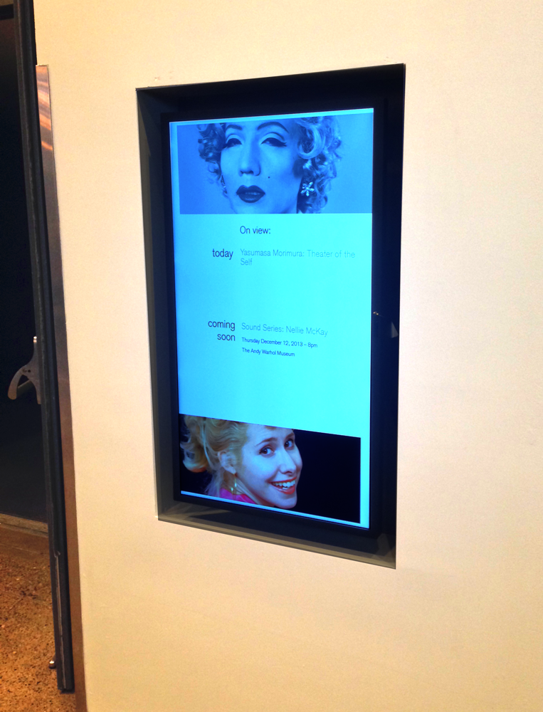
Finally, the site has a few ‘magic’ tricks up its sleeve, thanks to the new design. Recent HD monitors added to our lobby, as well as a brand-new iPad bar, are populated automatically with content from the updated site. This not only enhances guest experience at the museum, but also makes it easier for us to get information to our guests on all channels.
Sorry, IE8 Users
While there are a lot of new additions to the site design, one thing we’ve taken away is support for Internet Explorer 8. Why?
The main reason is that it’s very difficult to develop for IE8. It is a browser that originally shipped with Windows XP, before HTML5, CSS3, and other forward-leaning technologies were created. As such, it can’t support a lot of the things we’ve tried to do with warhol.org without a significant amount of time and energy to shoehorn code.
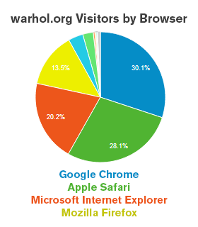
A second reason is that the payoff wouldn’t be that great: only 4.8% of our visitors view our site in Internet Explorer 8. Most visitors to our site visit in a different browser all together, while most other Internet Explorer users use more modern versions of this browser, like 9.0 or 10.0.
This decision also reflects a growing trend in the web industry, with more and more developers abandoning Internet Explorers 8 and below. Most notably, Google and YouTube have said they will no longer support IE8 or below beginning in January 2014.
What’s Left
While we’ve launched this new design, you may notice two parts of our site that haven’t transitioned yet: the Collections section, and the Resources and Lessons section under Education.
While we are working diligently to get the Resources and Lessons section transposed to the new design, the Collections section is a much bigger task. We are currently working on installing and configuring a new tool for our collections management system which will port a vast amount of collections records to the web. This will not only make the collection’s section easier to traverse, but also provide web visitors a much more wide-ranging view of the collection. Stay tuned for this new tool, debuting in 2014.
Some Extra Fun
Using archive.org’s Way Back Machine, I’ve pulled screenshots of warhol.org throughout the years. Check out the images below to see our humble beginnings as a single webpage all the way through to this latest redesign!


Thoughts? Comments?
I’d love to hear of any thoughts or issues our visitors are having with the new site. Feel free to use the comments section below.
Happy browsing!